Packaging
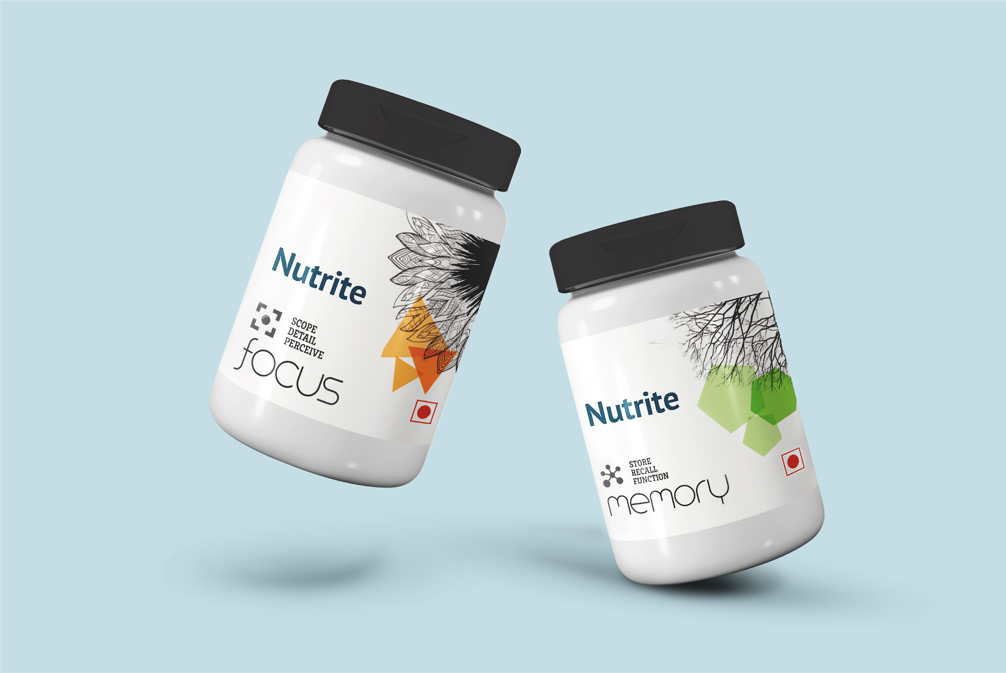
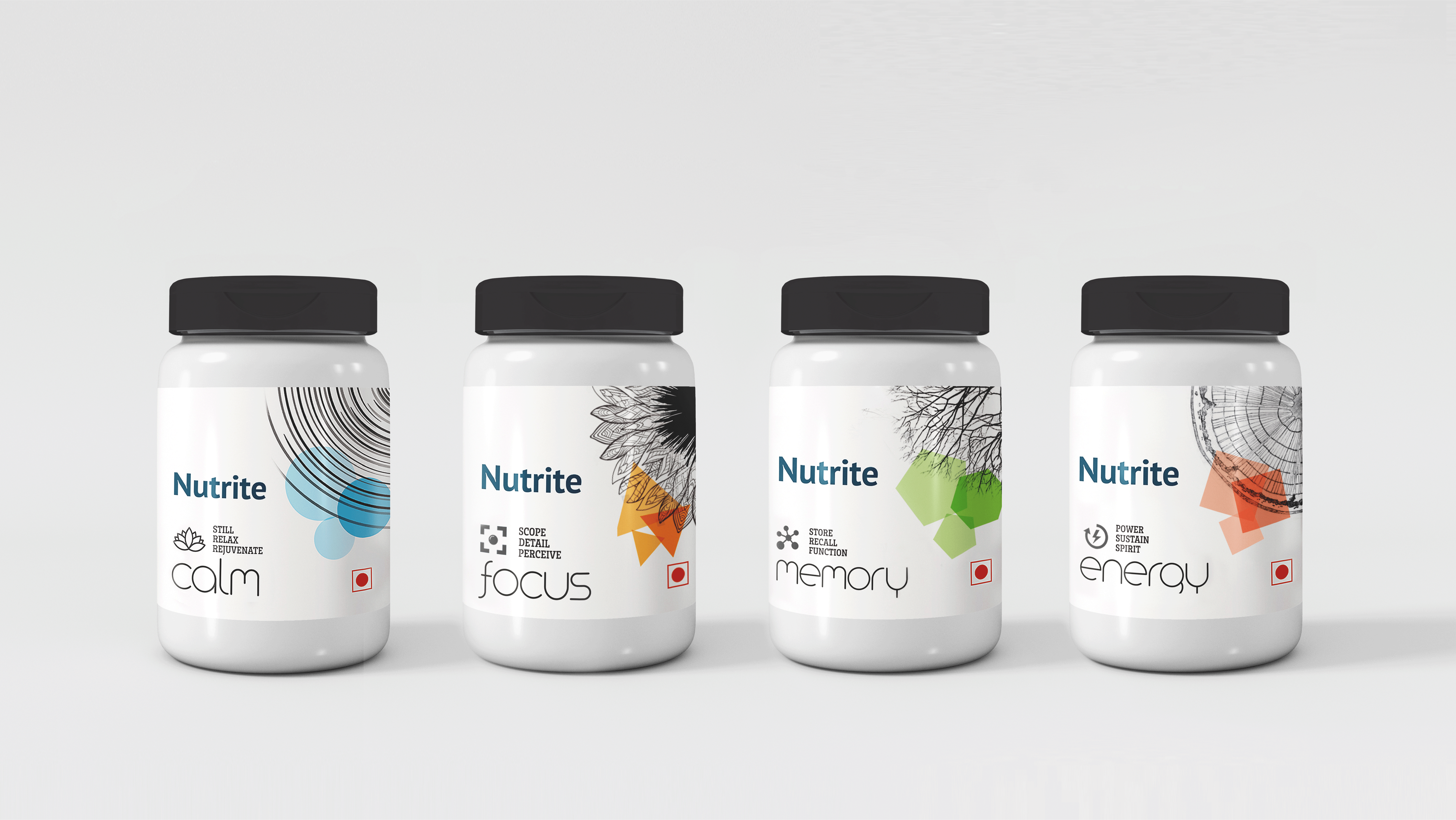
In the busy-ness of our lives, people struggle to find the perfect balance between health and an ideal lifestyle. Often, we push ourselves to live on the edge to keep up with our routine. Nutrite, a Brand that prioritises healthy living, found this as an opportunity to introduce a nootropic solution that targets to soothe the human body's high functioning unit - the mind.
Food and dietary supplements have slowly seeped into our routines, but this often comes with concerns. As people prioritise healthy living, it becomes imperative to think of natural alternatives to such supplements. Nootropics are often called 'cognitive enhancers.' While it may sound like they would make you smarter, it surely does help regulate the mood and combat urban evils such as stress and anxiety. A packaging design for a product this unique allowed us to challenge our creativity.
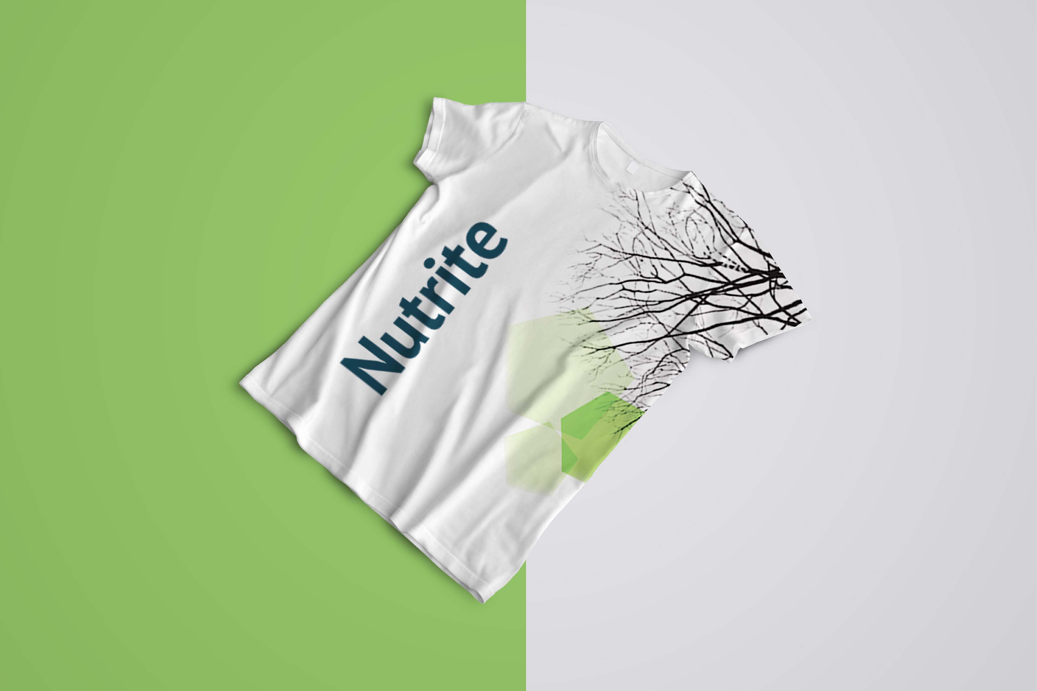
These nootropic solutions come in four variants which serve four different functions, mainly focus, memory, energy and calmness. The stylisation is pretty simple and also makes use of geometric figures. The layout is spaced out evenly, fusing the right amount of information and visuals. The visual language is systematic and adaptable according to the increasing roaster of products. In each of the variant designs, we used natural elements to graphically represent the category of the product. The sunflower is known to have dark bright pistil drawing attention towards it, which makes it fitting to represent the variant that improves one's focus. Similarly, the branches of a tree mimic the nerve cells which play a key role in passing information. Throughout the process, we found similarities between nature and the human mind and translated that into our designs.
B-1, 2nd Floor, Divya Smruti, Link Road, Opp Toyota Showroom, Chincholi Bunder, Malad (West), Mumbai 400064
©CulitvateDesignLLP

/Thumbnails/Aarambh Thumbnail.jpg)
/Thumbnails/Fintech Thumbnail.jpg)
/Thumbnails/CSR Mockup Thumbnail.jpg)
/Thumbnails/Thumbnail.jpg)
/Thumbnails/Neo Thumbnail.jpg)
/Thumbnails/PIL thumbnail.jpg)
