Packaging, Branding & Identity
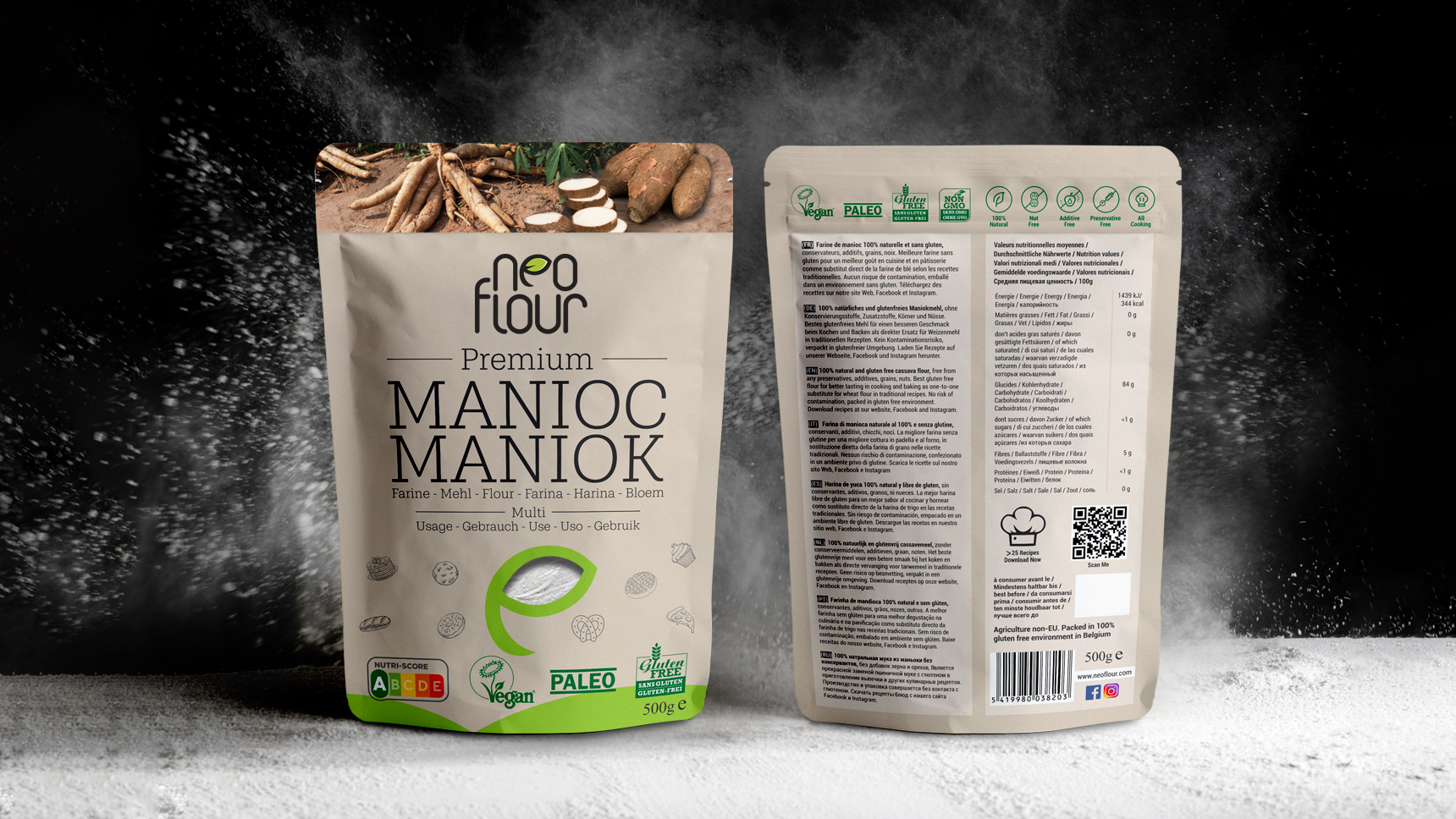
As humans, we cook to come together in celebration, to find comfort, or to express our emotions. Cooking has evolved through the ages and become a conscious practice. As people gradually progress towards eating clean and healthy, they seek out organic and gluten-free alternatives in the market that suit their lifestyle. For NeoFlour, an organic flour brand based in Belgium, we created a brand mark and packaging design that resonated with what the Brand stands for.
As a common ingredient across various cuisines, flour provides structure in almost all dishes. Cassava flour serves as a great gluten-free alternative to regular flours in the market. Since there is a wide variety of vegan and gluten-free alternatives in the market, there was a need to stand out from the rest while communicating the benefits of this 'new-age flour'.
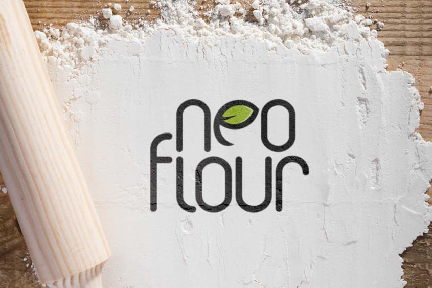
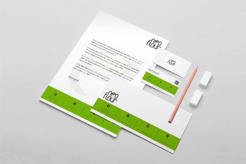
With this in mind, we designed a brand mark that would best represent the new-age flour. The leaf in the brand mark symbolises the freshness of the ingredients. Earthy colours are resonant throughout the packaging design. The subtle yet neutral colours are resonant throughout the packaging, keeping the product in mind. There is a hint of freshness with a touch of green in the packaging. To keep things real and transparent, there is a small window to peek into the goodness inside.
B-1, 2nd Floor, Divya Smruti, Link Road, Opp Toyota Showroom, Chincholi Bunder, Malad (West), Mumbai 400064
©CulitvateDesignLLP

/Thumbnails/Aarambh Thumbnail.jpg)
/Thumbnails/NUTRITE MOCUP THUMBNAIL-12.jpg)
/Thumbnails/CSR Mockup Thumbnail.jpg)
/Thumbnails/Thumbnail.jpg)
/Thumbnails/HFS Thumbnail.jpg)
/Thumbnails/PIL thumbnail.jpg)
