Packaging
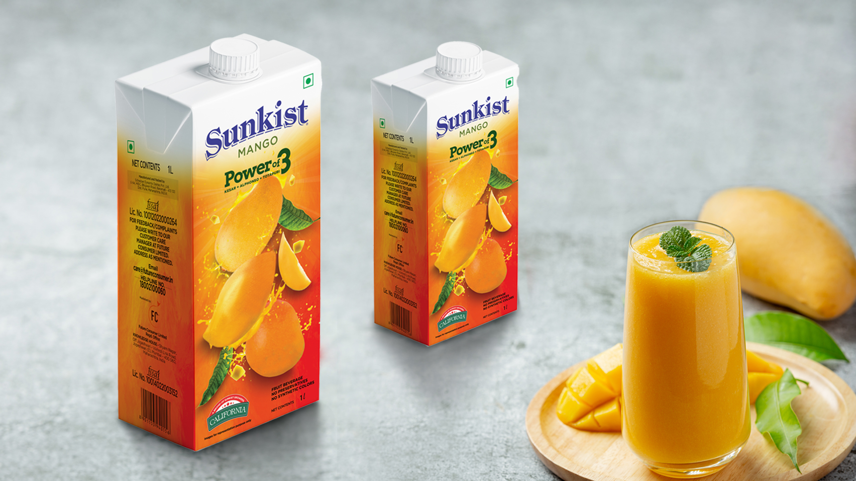
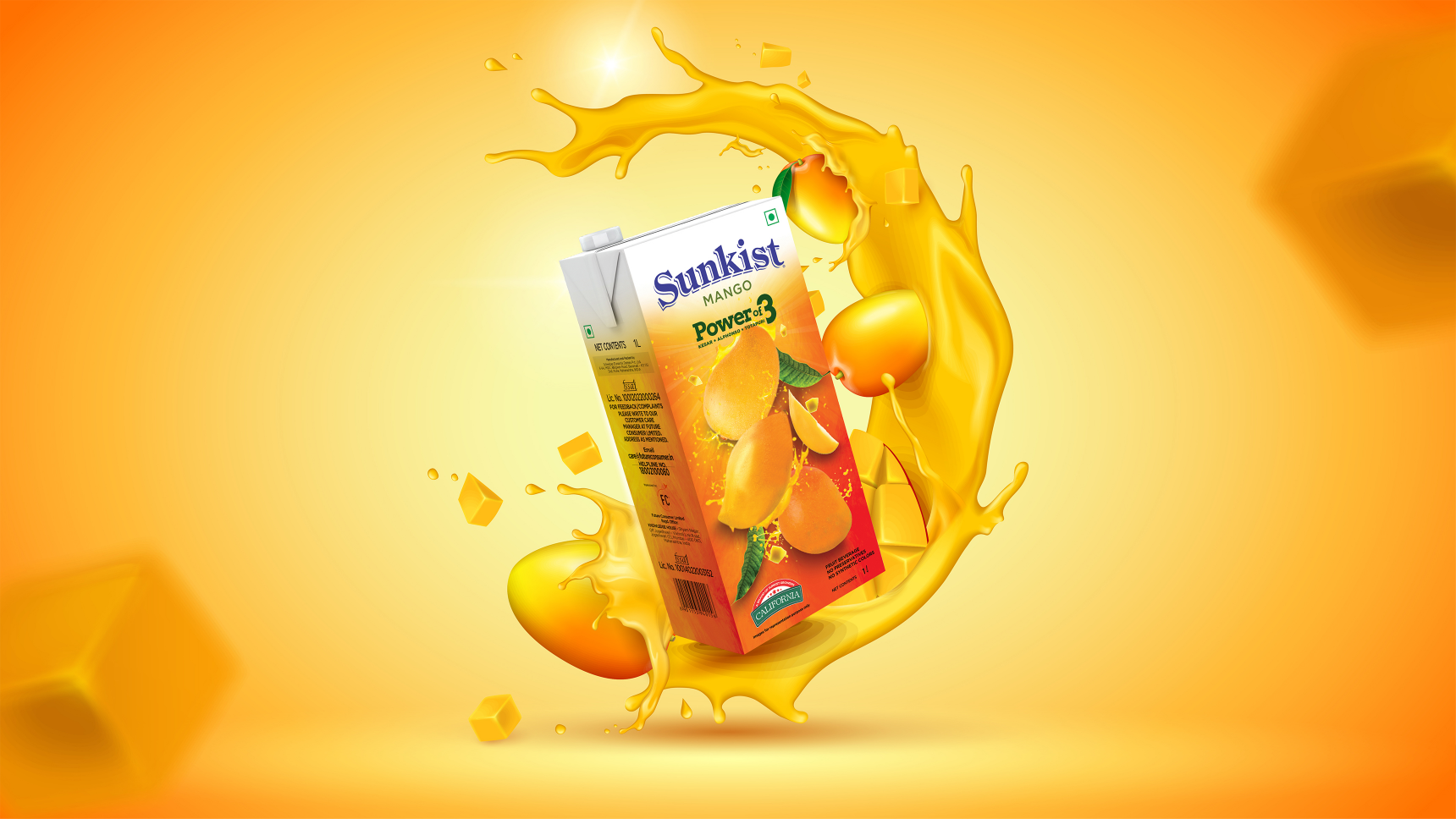
Fruit juices have become a quick fix for all our cravings. Be it a craving for some natural sugar or a drink to re-energise ourselves, we look for our desired fruit juices in local marts and grocery stores. A part of the Future Consumer Enterprises Ltd., the brand ‘Sunkist’ was looking for a new packaging design for its packaged mango-flavoured fruit juice.
As more and more people switch to a healthier lifestyle, they replace carbonated drinks with fruit juices. These grab-and-go packets of vitamins and other nutrients have become a more reliable option for many consumers to nourish themselves. In order to place prestigious and premium quality juices like Sunkist in the market, it was essential for the packaging design to stand out from the rest.
Sunkist has a strong brand image globally, and being one of the most trusted brands, we were driven to create a design that was honest in its approach. We made use of deep yellow hues throughout the packaging to give visual emphasis to the flavour. We aimed to keep the visual language quite simple and flexible to easily modify it according to the increasing roaster of their product ranges. One of the first things we look for in a fruit juice is for it to be authentic, therefore we found it imperative to graphically highlight the same by using images to glorify the ingredient. The goal was to incorporate the right amount of information with bold visuals to find the right balance.
B-1, 2nd Floor, Divya Smruti, Link Road, Opp Toyota Showroom, Chincholi Bunder, Malad (West), Mumbai 400064
©CulitvateDesignLLP

/Thumbnails/Aarambh Thumbnail.jpg)
/Thumbnails/Fintech Thumbnail.jpg)
/Thumbnails/CSR Mockup Thumbnail.jpg)
/Thumbnails/HFS Thumbnail.jpg)
/Thumbnails/Neo Thumbnail.jpg)
/Thumbnails/Rbl_ Mockup Thumbnail.jpg)
